Saturday, 29 December 2012
Thursday, 27 December 2012
Evaluation 3 - What Have You Learned From Your Audience Feedback?
Throughout the progression on my music video, I ensured that I got as much audience feedback as possible, as at the end of the day I needed to produce something that would appeal to my audience's desires. As the target audience I based my music video on was between 15-25 year olds, I was able to ask my friends in my year on what they thought about my video.
Once I had established the genre of my video and got some basic background information on my band, I was able to understand the ideologies this genre represented and got some ideas for my music video. After discovering that existing songs created by the band are usually about break ups or implying "love is a losing game", I decided to stick to this convention and base my video on these thoughts and feelings. Therefore, deconstructing music videos that I found inspirational, was extremely helpful to explore the codes and conventions music video use to appeal to my target audience.
After producing a first draft for each of my subsidiary tasks, I ensured that I showed my target audience to gain feedback on what they thought needed improving. Not only did I gain my audience feedback on my first drafts but on my second, third etc, to ensure that I was meeting their requirements on what they thought would make appealing ancillary tasks and a final music video. Receiving feedback from my peers gave me confidence in helping create my final products, as I knew with their opinions and improvements, I could make something that appealed to them.
Asking my audience's opinion was extremely helpful when I was editing each of my drafts for my music video. I showed them all of my drafts and made adjustments to my music video based on their opinions. As my first and second drafts were only a half the song, I decided to make an executive decision on what needed editing as well as asking my peers. At the time I had made my first full version of my music video, I was satisfied with what I had achieved but decided to ask several of my peer's opinions on it and see if they thought of it. After hearing their views, I realised I still had much work to do, involving me creating another draft before creating my final music video.
What I have learnt from audience feedback is that you can never have too many drafts or ever have too much advice on what needs improving on your work. Without asking my peer's opinion, I don't think my video would have been as realistic and touching as it is now, due to the fact I may have not noticed myself that the room I had originally filmed in wasn't "boyish" enough, as well as my talent Sam ducking too early when she was about to get run over. Therefore, by consulting with my peers at every opportunity I got, helped me produce appealing final products that my audience would either watch, read or buy. If I hadn't reflected in detail on their opinions, I don't think my video would be as successful as it is now I have finished it.
When asking my target audience's opinions on my final music video I received positive feedback throughout and all of the them had a preferred meaning. When I interviewed my friend Jamie about the song choice, she did say at first she had a negotiated reading about it. However, once I put my music video to the song, she admitted how she changed her mind and loved listening and watching my creation. She also mentioned that if more music videos were like this (with a relatable storyline or even shocking twist) to this genre of music, she may listen to this style more often.
Furthermore, I would say that I concentrated on the flow of meaning and flow of emotion throughout my music video, as I has to ensure that my audience understood the plot that he was looking back at their memories when she was alive. Obviously on first watch, people don't realise this until the end when they realise that she dies. Therefore, by people feeling empathy throughout, especially evoking sympathy at the end, shows that I successfully captures these in my video.
Reflection:
Overall, this coursework piece has helped my gain a greater understanding and importance of audience feedback, as without people's opinions there would have been no key into my video's success. Over recent years, marketing and viewing products online have increased popularity excessively, implying that it is becoming a major way of accessing people's opinions and finding out what people like and dislike. One of the main emerging technologies that keeps on growing is the popularity of social networking sites and viewing videos on YouTube. This is mainly down to the fact these pieces of software are accessible at anytime, appealing to individuals. Therefore, I thought it would be a good way to receive feedback by uploading my video onto YouTube and social networking sites such as Facebook and Tumblr (see below).


In Conclusion:
From gaining audience feedback from my peers and on social networking sites, I was able to ask their opinions to help me produce final products that appeal to them. If I hadn't constantly referred back to my target audience throughout each drafts of my different tasks, I may not have created a realistic looking music video that they enjoyed watching or ancillary tasks that would attract their eye.
Sunday, 23 December 2012
Evaluation 2 - How Effective Is The Combination Of Your Main Product And Ancillary Tasks?
When creating all of my products for my coursework task, I ensured that all of them fitted in with the idea of the memory and looking back at the past. Additionally, I had to ensure that I kept continuity throughout all of my tasks.
Video:

Advertisement

Digipak (Inside and Outside Cover)


One of the main ways I tried to keep continuity was the fonts that I used on both ancillary tasks. I ensured it was a bold font, as on existing album covers, there's are usually big and bold to catch the audience's eye.


Although the scene of my male protagonist looking up into the sky (like on my advertisement) didn't feature in my music video, but the scene of them holding hands together on the grass was including, creating a link between the two tasks (as he is wearing the same colour top).
Even though at first the outside of my CD cover may not seem to combine well with my other tasks, there is a link. For example, the idea of having the rose in their hands, implies that at the beginning of their relationship everything was under control and as you move on to the back and middle panel is showings their love falling through their hands and all is left is the memories which are slowly disappearing. Like my music video, I wanted to create a story throughout my ancillary tasks, although my video doesn't feature flowers in you associate them with death sometimes when leaving them on gravestones.
By including my talents on all on each one of my tasks, keep continuity throughout each link and subconsciously makes my audience realised that all of them are connected somehow to one another.
Here's a short video of my teachers giving their feedback on how all of the tasks that I have created link together. Although they may not be in my target audience, I decided them as well as my target audience on what they thought of my products to witness how the penumbra
effect works. As they know what happens behind the scenes I thought it was important to ask them, not just purely because they are good at media terminology!
Here are their opinions below:
Here are their opinions below:
As the video demonstrates, my teachers were impressed by all of my tasks and understood and acknowledge the key elements I purposely used and put in to create the message throughout my video, advertisement and digipak. Therefore, as both my target audience and teachers were impressed by my work, I feel as though I have succeeded in creating a successful video that links well with my combination of ancillaries tasks. Overall, I believe my products are effective in engaging my target audience's interest and was able to convey the message I wanted throughout each of my tasks.
Friday, 21 December 2012
Wednesday, 19 December 2012
Evaluations
Now that I have completed my music video and subsidiary tasks, I can now move on to starting my evaluations. Here are the 4 questions that I need to answer:
- In what ways does your media product use, develop or challenge forms and conventions of real media products?
- How effective is the combination of your main product and ancillary texts?
- What have you learned from your audience feedback?
- How did you use media technologies in the construction and research, planning and evaluation stages?
Sunday, 16 December 2012
Final Draft Of My Digipak
After making some adjustments to my previous drafts, I think I am finally happy with my digipak. Here are some enlarged images below:
 |
| Front Cover |
 |
| Back Cover |
 |
| Outside right cover |
Inside and Outside Cover:


Thursday, 13 December 2012
Second Draft Of My Digipak
After receiving feedback on which covers my peers preferred on my first drafts, I narrowed my outside cover options from 8 to 2.
Outside Cover:
Option 1:


Outside Cover:
Option 1:

I particularly like this draft for as it keeps continuity throughout the the outside of the panels, which I believe looks more appealing and professional. I also like this option due to the fact it conveys the message I am trying to convey, which is that their future was in their hands. Therefore, one wrong decision can be life changing, which I believe it represented in my music video. The use of the rose petals blowing in the winds, suggests the memories they once had are disappearing before their eyes and that they are no longer able to bring them back to life. Another reason why I like this draft is that the lack of saturation in each picture conveys the past and how they can look back at the memories but not re-create them, which I believe it also shown in my music video and advertisement poster. Although the rose isn't featured in my music video, it does links to the fact she dies at the end of the video. You usually associate flowers when people die, as you place them on someone gravestone, in the living memory of them, which I believe relates to the song (especially at the end).
Option 2:

One of the many reasons why I like this draft, is that is sticks to the conventions of Mayday Parade's iconic "umbrella man". The umbrella man is like their mascot and his face is never revealed, hence why I decided to get my talent to stand in front of a puddle holding the umbrella. Not only this though, but the reflection in the puddle is also featured in my music video, which would create a link that these products are advertising the same thing. The bare tree (back cover) was used to again link to the whole message I am trying to convey in general (in all three products), how not everything (like love) lasts forever and sometimes people are left with nothing. Although this draft may look rather "dull", I believe this works due to the fact that the song "The Memory" in particular has a sad ending and so do the rest of the tracks on the album.
..................................................................
Inside Cover:
I decided to use this inside cover of my characters walking away, as I believe this portrays the message I am trying to perceive, which I have mentioned since the very beginning. Another reason why I prefer this combination over the dandelion one, as I believe this has more depth to it, as well as linking to my music video and magazine advertisement. This also keeps continuity through the inside of the cover, which I personally think is more appealing.
Conclusion:
Although at first I liked the idea of sticking to conventions of the "umbrella man", when asking my peers on which cover they preferred, both male and females seem to prefer the flower combination. I thought that the rose draft may have been too "girly" when creating it however, when asking some male peers they said how they liked the continuity throughout each panel and the message they I was trying to create by it. As I am aiming to create a digipak that would attract my target audience eye, I should listen to their opinions and go with this draft.
Next Steps:
My friend cleverly noticed that on the back cover of my flower draft, the petals falling out of her hands are not visible. Therefore, I will need to go back to photoshop, add a layer mask on the background and ensure the colour of the petals come through onto the page, so people can understand the message of everything is falling through their hands.
Monday, 10 December 2012
Thank You Message For My Digipak
At first I wasn't going to add a thank you message onto the digipak as I didn't want that to detract the main attention of the message I want it to convey. Due to the fact that there are hardly any examples on the internet of Mayday Parade's album covers, I have had to improvise and go with my instinct on typical conventions you would see in a digipak. Therefore, looking inside other digipaks, I have noticed a common them of a thank you message, so I have decided to create my own based on typical conventions and what I have discovered about Mayday Parade themselves.
........................................................................
Myself, Alex, Jeremy, Jake and Brookes have been doing this for over seven years now and although it seems like yesterday since we started out, it really has been such a long but worthwhile journey.
Through the hardship of losing a band member, frustrations with labels and what seems like hardly any breaks, we hope that we have delivered and proven to you, we are dedicated to you, our fans. No matter what, we will always make music and always be on the road. So to those who have been there supporting us from day one and others who have joined along the way, we can't thank you enough for being our pillar to success. Without you there would be no success, no albums, no us. So to you we are eternally grateful.
Another huge thank you to Zack Odom and Kenneth Mount, who both help produced our new album, as you guys have been there since the creation of our first album "A Lesson in Romantics". We really do appreciate the time and effort you have put in to help us produce our third full album. We never expected to get this far, but we know for certain that we will never turn back.
To Fearless Records who have believed in us from the start, promoted all of our work and for never giving up on us like some others have, we are forever in your debt. We also appreciate the chance that the Independent Label Group took on us in recently signing us up. Many other labels that have let us down in the past may consider us a risk, but we will never let you or our fans down.
Lastly, thank you to all of our friends and family who have encouraged us to keep going and stay strong when we were all afraid everything was falling apart. Your motivation has kept us going, willing us to keep on writing songs, sharing our experiences and messages with you.
Now we have realised we just want to make music for the lovers of our music, we don't mind where we play or how much we sell because at the end of the day, your support will determine our overall success. Our journey as a band is no where near over and on behalf of Mayday Parade, I sincerely hope all of you will stick with us to see this through. Let’s build something beautiful together!
Derek, from Mayday Parade
Friday, 7 December 2012
Audience Feedback On First Draft Of My Digipak
I thought it would be a good idea to ask some students from my media course to ask their opinions on what they thought of my first drafts, ensuring that I am focusing on their desires.
To gain audience feedback, I printed off a questionnaire (including all of my drafts in colour on the piece of paper) asking for my peers to circle their favourite digipak combination and why. When I added up the results, 2 drafts had equal amounts of votes and therefore I thought it would be best to edit both combinations again, rather than pick just 1 out of the two, as my audience could change their minds and prefer a certain one on my next drafts. Here are the two combinations below that they liked:

 They overall feedback I got from the questionnaire was that they liked the rose one for it's continuity within each panel and the liked the bottom one, due to the fact it follows typical conventions of Mayday Parade's existing album cover.
Although at first I would have liked to have had bright, bold colours on my digipak, the title of the album "The Memory" is about the past and therefore, I believe my peers are right in choosing the less saturated combinations, as they tie in well. Furthermore, the main themes portrayed on this album are songs about the past, reflecting on how love is a losing game. This is shown on all of the songs in my opinions but especially "The Memory", "Anywhere but here", "Bruised and Scared" and "Kids in Love". I believe the options that I have narrowed it down to, thanks to my target audience are the right choices.
Next Steps:
For my second drafts there are a few alterations that I will need to make in order for my digipak to look more realistic. For instance, I will need to:
To gain audience feedback, I printed off a questionnaire (including all of my drafts in colour on the piece of paper) asking for my peers to circle their favourite digipak combination and why. When I added up the results, 2 drafts had equal amounts of votes and therefore I thought it would be best to edit both combinations again, rather than pick just 1 out of the two, as my audience could change their minds and prefer a certain one on my next drafts. Here are the two combinations below that they liked:


Although at first I would have liked to have had bright, bold colours on my digipak, the title of the album "The Memory" is about the past and therefore, I believe my peers are right in choosing the less saturated combinations, as they tie in well. Furthermore, the main themes portrayed on this album are songs about the past, reflecting on how love is a losing game. This is shown on all of the songs in my opinions but especially "The Memory", "Anywhere but here", "Bruised and Scared" and "Kids in Love". I believe the options that I have narrowed it down to, thanks to my target audience are the right choices.
Next Steps:
For my second drafts there are a few alterations that I will need to make in order for my digipak to look more realistic. For instance, I will need to:
- Change the font of "The Memory" on the front cover, as it is not the same as the one I used on my advertisement poster (need to ensure I keep continuity throughout all of my products.
- Add text onto the back cover e.g. song list and references at the bottom.
- Add a barcode onto the back cover and record labels.
- Add a thank you note onto the blank outside cover (on the left) to add more information onto the digipak.
Thursday, 6 December 2012
First Draft Of My Digipak
As I have mentioned in my previous "Digipak Research" post, Mayday Parade's existing albums go against particular conventions you would expect from "normal" digipaks. For instance, the most common feature that you would usually see on a digipak is the artists face, however with all of my band's existing covers this isn't the case. Although I may be going against typical conventions from other artists, I am sticking to Mayday Parade's conventions for their albums.
The layout I have chosen for my digipak is to have six panels, where you have the front cover on the right, the back side in the middle and the right outside cover is on the left (so it's a backwards design really!) This was the only way I could visualise the digipak working and I believe it looks best like this.
Now that I have collected my ideas of my digipak from my drawings, I decided to bring them to life by taking pictures of each shots that I scribbled down. I am trying to ensure that I link all of ancillary tasks together with my music video. As my song is called the memory, I believe the pictures I have taken and shots I have edited work well with the theme. Here are my of examples that I have been working on:
Outside Cover:
I ended up creating rather a lot of drafts as I was undecided on which ones I preferred, so I thought I'd make as many as I could (by looking back at my drawings) and ask my peers which ones they like to help my come to a conclusion.
 |
| Outside cover (left), Back cover (middle), Front Cover (right) |
 |
| Outside cover (left), Back cover (middle), Front Cover (right) |
I personally like the rose combinations, as for me they tell a story. Although by looking at them you would just see them as having a rose in someones hands or petals blowing away in the wind. However, the message I am trying to convey (represented by the rose in their hands -front cover), how the couple were in control of their relationship at first as well as implying their future is in their hands. Therefore, one decision or wrong move can change everything, which I believe it represented in my music video. The use of the rose petals blowing in the winds, suggests that the memories they once had are disappearing before their eyes and that they are no longer in control of the situation. This again links to to my music video to the part when she gets run over, as there is nothing he can do to bring her back and create anymore memories with her.
 |
| Outside cover (left), Back cover (middle), Front Cover (right) |
 |
| Outside cover (left), Back cover (middle), Front Cover (right) |
Although these drafts look rather similar, I did try to differentiate them by using different images of the dandelions. This was mainly down to the fact I was undecided which looked best. In a way these two drafts represent the same ideas as the rose ones, because it displays their love losing to the hardships of life. In this case the dandelion seeds are losing to nature (the wind) which can occur on any random day. This I believe is represented in my music video as the one argument the couple have, forces her to leave the house out of frustration. This causes her to make a split second decision of whether she should turn back and apologise or go and by her choosing that path she lost her life to the unexpected evident that sometimes occur randomly in life (just like the wind/weather in a way).
 |
| Outside cover (left), Back cover (middle), Front Cover (right) |
 |
| Outside cover (left), Back cover (middle), Front Cover (right) |
These two drafts are my memory combinations. As I am aiming to ensure my products link together, I thought it would be a good idea to use some of the props that I used in my music video to feature on my digipak e.g. bubbles and their memories. The use of the pictures being torn up convey how that not all love stories are like fairy tales and have a happy endings; break ups can occur and love is lost. Although my music video takes the losing love to the next extreme, it proves the point that unexpected occurrences can happen and that one decision can change both of their lives. I'm not totally convinced that the combinations still work together and achieve the message I am hoping for, however, I can ask my peers what they think as well as keep experimenting with options if I wish.
 |
| Outside cover (left), Back cover (middle), Front Cover (right) |
 |
| Outside cover (left), Back cover (middle), Front Cover (right) |
These two drafts are yet again rather similar, as I have kept some of the pictures the same. I decided to do this as I was unsure which combination worked the best. The main reason I used these pictures in these drafts is mainly because of the fact the puddle scene is included in my video and I have to keep continuity throughout my products. Linking back to Mayday Parade's existing albums too, they all seem to feature the "umbrella man" or the red umbrella, so I found myself a red umbrella and use my talent to star and recreate the image. By keeping to these conventions, I believe they not only look similar to ones you would find from the band, but also links you to the music video, causing the link, which could enable a bigger promotion of sales.
Inside Covers:
I only created 2 drafts of my inside cover, as I was more decisive in what I wanted to produce. The main idea I had was to have one picture that I could split into three sections to keep continuity. Like I mentioned in my "Digipak Research" I particularly liked Rihanna's digipak that has a picture of her spread out on the three panels, which I would like to recreate. So this is why I choose these two photos.
 |
| Inside left cover (left), Inside middle cover (middle), Inside right Cover (right) |
Although dandelions don't feature in my music video, this does convey the messages of their memories fading away which is portrayed in the song. Also the album I am recreating "anywhere but here", which features "the memory" in, has a common theme of losing to love or an end to something. So I thought by having a dandelion full of seeds, shows the start of love and by it being bare at the end, leaves the idea that the characters are left with nothing and their love is now gone.

 |
| Inside left cover (left), Inside middle cover (middle), Inside right Cover (right) |
I decided to create this draft, as this picture happened to be one of the images that I put in my scrapbook and also them departing from each other is included in my music video as well. I also believe this is the clear picture that displays the aim I am trying to convey. As they are literally separating from each other, shows they are walking away from their chances of love to continue. Additionally, this is a perfect example of a image I could use and split into three sections to encapsulate my idea with.
Conclusion:
I would say that the drafts that I have produced, link well with my music video as puddles, rain, pictures, memories, bubbles etc do feature in my final product. Although I do believe that all of my drafts are able to convey the message I am hoping for, so are more effective than others. At the end of the day, I need to think about my target audience, as they would be the ones who initially buy my end product, so I need my ideas to appeal to my peers. Therefore, I think my next steps will be to ask people to look at my blog and say which ones appeal to them most so I can add text onto my next drafts.
Monday, 3 December 2012
Representations My Music Video Produces
Throughout my music video I tried to keep to the true representations and ideologies of how couple act when in a relationship. In my video there are two characters, one boy and one girl, who are in a relationship, however, it hits breaking point with an arguments resulting her leaving the house.
The girl:
During the happy memories of their relationship she is represented as a bubbly and happy individual spending time with her boyfriend. However, as they get into an argument, she shows a different side by standing her ground and not being perceived as weak and vulnerable woman which many people would have stereotypically thought her to be (throughout history). I think if I had stuck to the stereotypical woman I wouldn't be display a true representation of women from this current day.
The boy:
Throughout their happy memories he is perceived as a "loved-up" teenager whose girlfriend is his world. This is particularly shown when he is left on his own to carry on life without her, as he can't seem to cope (due to the fact he is constantly looking back at the past). Additionally, this is displayed mainly when he looks for comfort in the scrapbook and constantly reminiscing of the happy times they once shared together. The scene where he has his head in his hands, portrays him as heartbroken and I believe this is how a guy would act if he had lost his first love.
The couple:
The boy and girl together, are represented as a stereotypical couple who are "lovey dovey" during the happy memory moments. Like the majority of couples, they have arguments and make up. However, they don't get the chance as she gets run over, which in a way is an unstereotypical representation of a "break up".
Representations:
By sticking to true representations of both of the characters, I believe that my target audience where able to emphasise with the storyline I created. Although it is not an everyday occurrence to have your loved one get run over, the message I am trying to perceive is how one decision can have an huge impact on someones life. Not only this, but couples who have gone through arguments and feel similar regret like in the video, understand how the protagonist wishes he could take things back that were said between them. However, as showed in this video, it is not always easy to do, as people can leave your life as quickly as they entered. The use of argument scene especially, helps creates a "likability" from the audience for the characters as they maybe able to relate to this regretful situation, which I believe provokes emotion while watching the video. The audience feel sympathy for both character, but more so the male, as the song is sung from his perspective and point of view.
Relating back to my video, I believe that I used most of the uses and gratifications that I mentioned earlier in my previous post. Firstly, I ensured that I linked my music video into informing a hidden message of "how one decision can change the rest of your life ", so that satisfied my audience "seeking advice on practical matters or opinions and decision choices". Although though the music video doesn't entirely tell people what to do in these sort of situations, but shows that life is unexpected and that anything can happen. In a way it also reinforces the idea that there are a variety of choices in life you can make just be careful on which one you choose as it could change both you and others lives forever, which I think it was Mayday Parade were trying to convey in the lyric of this song.
I would say that my audience were able to gain personal identity from my video, as they can relate to how either character was feeling if they have lost a loved one before. Although this situation doesn't occur everyday it does suggest that people can lose love at any point in their life, whether they are young or old. I believe the title itself "memory" has a strong message that works well with the lyrics and this is why I represented my music video in this way. Additionally, my peers could even feel a sense of satisfaction knowing that someone is going through the same emotions as they are (losing someone dear to them). It may be a storyline and a fictional music video in a sense, but people have a tendency to use music video as a form of escapism of their lives.
Furthermore, I would say that my music video links well to social interaction and integration. This is mainly down to the fact I tried to gain an insight into unexpected circumstances that could happen to others during their lifetime, which I feel evoked empathy for others. I think I was able to gain empathy for the characters in my music video, as a variety of people did cry towards the end, implying they felt it was a realistic situation. I also believe my music video identified with others, as if people had gone through this situation or whether they had just lost to love they would be able to gain a sense of belonging. Due to the fact, my music video has a touching twist to the end, no one really expected it as they assumed it would be your "typical" break up video. However, once they had discovered this, I overheard a variety of people talking to their friends about it, heightening the fact word of mouth was present here and they did enjoy watching it.
Lastly, as music video are primarily used for entertainment purposes, I would like to think that I didn't disappoint on this factor. I also think I achieved ritual pleasures, with the shots that I used in my music video. This means that people recognised typical conventions you would see in music video like the lip syncing involved in mine. Overall, I feel this I was able to create a successful music video that people enjoyed watching, as well as ensuring they appreciated the message behind the lyrics.
Thursday, 29 November 2012
Audience Feedback On My Final Music Video
As I am making my music video to appeal to my desired target audience, I thought what better way to see what they thought of my coursework than to ask them 3 questions on what they thought about my video, once they had watched the final product. Here are their feedback below:
I also decided to film Tom and Sam's (my talent) opinion on what they liked and enjoyed performing in my music video. I was intrigued to discover if my audience (that I had already asked) enjoyed watching the same bits of my music, that my talent's did too when performing the scenes out. Here are their responses:
On reflection to my audience feedback:
Although no-one particularly said they could personally relate to this story, I do know of many relationships that have broken down and due to that one decision things have change dramatically, which was what I was aiming to create in my music video. Referring back to the uses and gratifications theory by Blumler and Katz, I would say that my music video purpose was for the audience's entertainment, as well as creating a diversion from their everyday lives and maybe even people occasionally finding themselves reflected in the text (personal identity).
Overall, I had to take into the consideration of everyone's reception of my music video. According to the reception theory (based on Stuart Hall's work) the text (produced by myself) can be decoded by my audience in different ways. Therefore, I had to use recognisible codes and conventions to ensure my audience understood the music video and what message I was conveying. On reflection to my audience feedback (above), I believe that all of them decoded it in the way I wanted them to, which was a sad break up music video with a traumatic, yet shocking twist. I don't think that my text was aberrantly decoded as no one didn't understand the concept of my music video, so in conclusion, I would say I created a text which a preferred reading.
Monday, 26 November 2012
My Final Music Video
In comparison to the previous full music video (Fourth Draft) I believe the transition from the protagonist pressing the remote to control the projections on the wall, is a lot more obvious for the viewer, as they can tell where the memories are coming from. I think this is a big improvement compared to my last draft, because if my target audience did not know the storyline, they may not of understood the projection scene, but now that I have re-filmed it, I believe it is easier to follow. Here is my final draft of my music video!:)
Wednesday, 21 November 2012
Photos For The Digipak
Today in my free study periods I thought it would be the best oportunity to start taking my digipak photos. I asked one of my friends who also had the same study periods as me so I was able to director her in what I needed doing whilst I took the pictures. I also needed my talent Tom to come over so I was able to take the second half of the photos with him in (e.g. the reflection in the puddle and walking in the rain with the umbrella etc). Here is a slide show of all the original photos that I took:
After looking at Mayday Parade's existing albums and single covers, I thought it would be best to edit the original photographs in a cartoon styled fashion on www.picmonkey.com. Here are my chosen images that turned out the best in this style and the possible pictures that I will most probably use for my digipak.
.......................................................
I thought it would be a good idea to show how I created the cartoon/animated feel to the picture from the original photos.

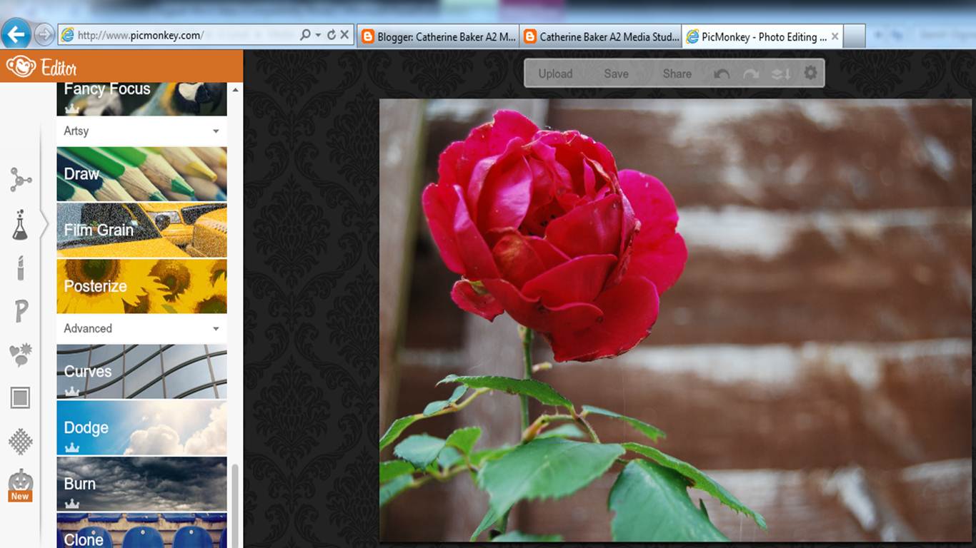
Here is one of the original picture of the rose I took in my garden. I decided to have a look at all of the effects you get on the picmonkey website and see if they had any cartoon/animated style. I came across the "posterize" effect on the left had side.

Once I had messed around with the levels of colours, amount of detail and how much to fade the pictures by, I ended up with this (above) as the final product.
Monday, 19 November 2012
Initial Ideas For My Digipak
When thinking about to my chosen song "the memory", I decided to brainstorm everything that I associated with happy memories fading away or things falling apart. In the end, I came up with:
Front Cover Ideas:
.jpg)

Back Cover Ideas:

Next Steps:
- A rose wilting or breaking apart
- Petals/leeaves/dandelions seeds blowing in the wind
- Polaroid styled pictures on the ground
- Clouds in his eyes (to show he is looking up to her thinking about their memories - like in the music video)
- Reflection of him in a puddle
- Bubbles flying in the air and me editing the pictures of the happy couple in it
Inside Cover Ideas:

Back Cover Ideas:

Next Steps:
Now that I have drawn out potential ideas for my actual digipak, I will now plan a day where my friends or even talent are free to take these images and make them come to life.
Friday, 16 November 2012
Digipak Research
 What is a digipak?
"A digipak is a fairly recent type of
packaging for CD's, which is typically made out of a heavy cardboard material. It will
normally open like a book or be in three parts with one opening to the left,
another to the right and the CD in the middle in the more traditional 'jewel CD
case' stuck onto the card background. They are most frequently used for special
edition releases and allow for more information, including lyrics or
information on the band and more graphic display."
I particularly like Rihanna's digipak as she keep continuity throughout all of the sides, which I believe makes it more visually appealing. Therefore, I will try and create a digipak that sticks to a sort of theme or continuity throughout.
I particularly like Rihanna's digipak as she keep continuity throughout all of the sides, which I believe makes it more visually appealing. Therefore, I will try and create a digipak that sticks to a sort of theme or continuity throughout.
....................................
Although these aren't necessarily digipak's, here are a variety of albums and singles that Mayday Parade have produced so far.

Conclusion:
After doing some research into their existing products there seem to be a common theme within all their work. None of their albums actually have the band members on the cover, which is rather unconventional for "typical" albums. However, due to the fact I am creating a promotional digipak for their album, I should stick to their convention of not having the artist on the cover. Another similarity between these front covers is that, they are not real life images, they have an animated/drawn feeling to it. I will try and stick this convention, although I have no idea how to create this effect at the moment! So I will to have to have a look at the editing website called picmonkey or any others if they can help me with this sort of style.
Tuesday, 13 November 2012
Fourth Drafts Of My Music Video
After re-filming the scrapbook scenes in my talent's room, I believe this was a good move and works much better than my original completed version, as the location look more appropriate and like a boys room in comparison to my previous attempts. Here is my fourth draft below:
Overall, I am glad that I took on my audience's feedback on what they thought of my third draft (first completed version), as I have been able to edit the video in numerous of ways, which I believe makes it look much more realistic.
Next Steps:
After looking back at this draft of my music video, there are a few little things that I think could be adjusted to make it better and put my perfectionist side to rest! One of the little things I noticed was that when he goes to play the record button on the remote, he goes straight from that to the projections on the wall and couldn't tell they were playing from the video camera. For someone who doesn't know the storyline of my music video, may get a little confused to that fact and therefore I need to re-film this scene to ensure they are being shown on the wall from the projector. This will be my main next step for my next draft. I may also tweak the timings throughout the video, making things slower or faster depending on the points of the song, as I believe the clips should fit to the best of the music.
Subscribe to:
Comments (Atom)